A conversation with Valentina about La Corallina’s Okinawa Collection There are objects created simply to be...
Latest posts
-
 Okinawa: the Circle, the Sea, the GestureRead more
 -
 Forms of Light: a conversation with Lorenzo about La Corallina’s lamp basesRead more
There are objects that do not merely support light, but prepare it, hold it, almost think it before it happens. The...
-
 Interview with Gioia, founder of La Corallina, on Ikat and its historyRead more
Ikat is an ancient technique, and this alone makes it fascinating. The term comes from the Malay mengikat, meaning...
-
 The shape of SpringRead more
That is exactly the case. Color is never neutral, but in spring this truth becomes evident. It is no longer contained...
-
 NEW COLLECTION ZODIACRead more
With this series of zodiac charger plates, we chose to move away from the most predictable idea of an astrological...
-
 Interview with Lorenzo Lambardi, Product and Store Manager at La CorallinaRead more
In less than a decade, with La Corallina we have managed to build a clear and recognizable identity, especially in...
-
 Interview with Valentina on the Concept Behind the Zanzibar CollectionRead more
In Zanzibar, color is not decoration but a true language. We wanted to avoid any form of neutrality: every shade is...
-
 New collection Natale in CittàRead more
There is, in La Corallina Firenze’s new collection Natale in Città, something that goes beyond the object itself,...
-
 “Las Palmas”: When Design Meets the TableRead more
In the Las Palmas collection, La Corallina offers a refined reflection on the charger plate as a design object—no...
-
 Floral Autumn. An Interview with Valentina from La CorallinaRead more
With the arrival of September and the first warm shades of the season, we met Valentina, the creative soul behind La...
Blog categories
Search in blog

Okinawa: the Circle, the Sea, the Gesture
Related posts
-
 Mise en place perfetta con i sottopiatti La Corallina!
I sottopiatti La Corallina sono accessori essenziali per la mise en place, in grado di dare un tocco di stile e...Read more
Mise en place perfetta con i sottopiatti La Corallina!
I sottopiatti La Corallina sono accessori essenziali per la mise en place, in grado di dare un tocco di stile e...Read more -
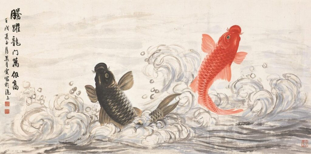 Carpa Koi: la simbologia della carpa nell'arte orientale.
Con il termine giapponese “KOI” si individua essenzialmente il pesce noto come carpa. In realtà il termine è generico...Read more
Carpa Koi: la simbologia della carpa nell'arte orientale.
Con il termine giapponese “KOI” si individua essenzialmente il pesce noto come carpa. In realtà il termine è generico...Read more -
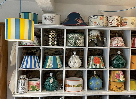 Estate, tempo di paralumi in riva al mare
As the beautiful season approaches, our seaside home also needs a makeover. We can start spending lovely days...Read more
Estate, tempo di paralumi in riva al mare
As the beautiful season approaches, our seaside home also needs a makeover. We can start spending lovely days...Read more -
 Colonial Style Furniture: History, Tips, and Curiosities.
Lo stile coloniale è un'interpretazione di arredamento che trae le sue origini proprio dal periodo coloniale. Nasce...Read more
Colonial Style Furniture: History, Tips, and Curiosities.
Lo stile coloniale è un'interpretazione di arredamento che trae le sue origini proprio dal periodo coloniale. Nasce...Read more -
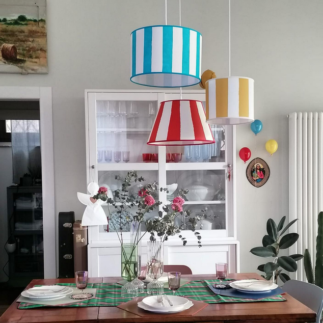 Come scegliere il giusto Paralume.
Come scegliere il giusto paralume? Regalare un paralume è senza ombra di dubbio un'idea originale e molto...Read more
Come scegliere il giusto Paralume.
Come scegliere il giusto paralume? Regalare un paralume è senza ombra di dubbio un'idea originale e molto...Read more
Leave a comment